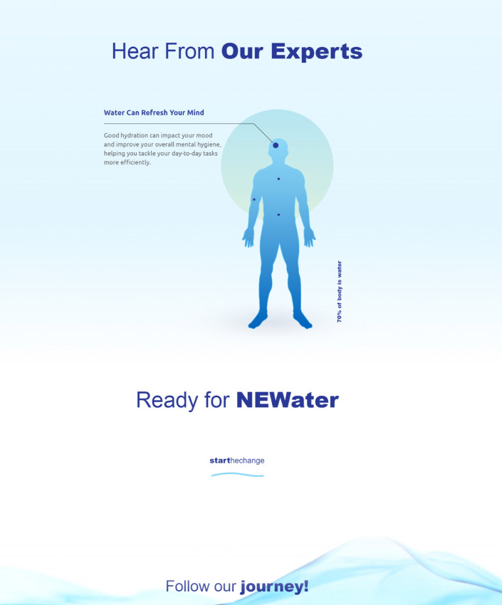
Background Gradient

Responsive Web Design Company

Work with a leading responsive web design agency to plan, design and create a custom digital experience that functions seamlessly across devices.

  • Custom UX & UI Design
  • End-To-End Development
  • Engagement Across Devices
Request a Quote
Designrush logo

5 Star DesignRush Reviews

Web Design
Excellence Award

ecommerce-agencies-2024
Designrush logo

5 Star DesignRush Reviews

Web Design
Excellence Award

ecommerce-agencies-2024
Scroll Down

Responsive Web Design Services

Streamline your user experience across devices with our responsive web design services.
CLICK TO VIEW MORE

Responsive Web Design

CLICK TO VIEW MORE

More than half of internet users around the globe use their mobile device when accessing a website. A responsive design ensures you’re not missing out on traffic from mobile users.

Responsive Web Development

CLICK TO VIEW MORE

From planning and design to development, we ensure your website provides a consistent user experience (UX) across devices.

Mobile-First Design

CLICK TO VIEW MORE

Currently, the number of mobile devices in the world surpasses current world population at over 8 billion. We ensure you don’t miss on any piece of that market by implementing our mobile-first design.

Whether on Android or iOS, we’ll ensure your website offers the same seamless user experience for all of your site visitors.

Website Marketing

At Digital Silk, we have the expertise to not only design and develop your responsive web design but also increase your website’s traffic.

Through our search engine optimization (SEO), retargeting, PPC and email strategies, we will help you attract qualified leads to your website and convert them into paying customers.

Responsive web design agency custom website designs
Request A Quote

Grow Your Digital Presence With Digital Silk

"*" indicates required fields

This field is for validation purposes and should be left unchanged.

Responsive web design agency custom website designs
Background Gradient
Our Clients

Top Responsive Web Design Agency

We work with brands of all sizes across industries to improve digital experiences.

babiesrus logo
Babies R Us
rollink logo
Rollink
EV Universe logo
EV Universe
Northwestern_Qatar_Logo_2_
Northwestern University
ibm logo
IBM
buddha brands logo
Buddha Brands
paul stuart logo
Paul Stuart
spar bernstein logo
Spar & Bernstein
Sony logo
Sony
new-dev-rev logo
NewDevRev
Dognomics Logo
Dognomics
Mitsui Plastics logo
Mitsui Plastics
puma logo
Puma Energy
xerox logo
Xerox
enchant logo
Enchant Christmas
grenco logo
Grenco Science
OUR WORK

Responsive Web Design Portfolio

Take a look at our responsive web design portfolio that includes
B2C, B2B and eCommerce brands of all shapes and sizes.
Featured
  • University Web Design

    Making a great first impression through strategic site planning and design.
  • Electric Vehicle eCommerce Marketplace

    Strategically connecting consumers to a dynamic electric car marketplace.
  • Biotech Brand & Digital Presence Development

    Delivering a data-driven brand architecture strategy to boost SNP’s digital presence.
  • Gamified Digital Platform

    Creating an engaging experience through custom website design.
  • Hi-Tech eCommerce Store

    Making superior sound technology accessible through a simplified sales funnel.
  • Premium Luggage e-Shop

    Launching an innovative luggage concept in the U.S. with a redesigned digital presence.
  • Real Estate Digital Experience

    Building a visible online presence through branding, web design and development.
  • Luxury eCommerce

    Reinventing timeless men’s clothing with a classy new website.
  • Reimagined eSports Platform

    Growing fanbase & conversions with a legendary community site design and eCommerce development.
  • Food & Beverage Web Development

    Driving visibility, trust and new partnerships with a professional B2B website design.
  • Modern Energy Website Redesign

    Overhauling a website with responsive design, customized user flows and comprehensive SEO
  • B2B eCommerce Design & Development

    Managing every aspect of the website design and development process, from planning to launch and beyond
  • Law Firm Digital Presence & Visibility

    Driving traffic from a targeted audience with organic search techniques
  • Immersive Events Website

    Matching a unique brand identity with an equally captivating online experience
  • Responsive Redesign With Superior Navigation

    Our full suite of agency solutions, from digital strategy to messaging, site architecture and responsive development, transformed Northwestern Medill’s online experience. 

    We produced an engaging, easy-to-use experience through micro-animations and a meticulously planned user journey to boost conversions and drive student and staff satisfaction. 

  • An Optimized Design With Strategic Branding

    Our team crafted a cutting-edge, on-brand design that strengthens the distinctive visual identity of electric vehicle marketplace EV Universe.

    Featuring dynamic visuals and interactive elements, the innovative platform drives credibility while elevating user experience for buyers and sellers alike.

  • Engaging Biotech Website Redesign

    We delivered a custom website redesign alongside new brand positioning and brand messaging solutions to rebuild SNP Therapeutic’s visibility in the DNA testing market.

    Following in-depth research, our brand and digital strategists crafted a corporate design across redefined site architecture.

  • Stripped Back Tech Design

    Our award-winning designers approached Sony Rewards’ aim to increase on-site engagements by delivering a stripped-back custom web design.

    The intuitive technology website features easy-to-use dropdown navigation menus and crystal-clear CTAs to drive signups.

  • Custom Web Design & Brand Positioning

    By creating a distinctive design tailored for a high-end electronics eCommerce store, we helped position Bang & Olufsen as a tech market innovator.

    With a unique design and a streamlined sales funnel, our digital solutions targeted both UX and UI to grow brand visibility and customer engagement.

  • Supporting Expansion by Driving Revenue

    From website design to digital marketing, brand strategy and SEO, our end-to-end digital solutions helped Rollink grow their revenue by 500% as they entered the U.S. market.

    Our WooCommerce-powered solution features micro-animations, an immersive product experience and a checkout process optimized for conversions.

  • An Upscale Real Estate Experience

    Our web design and development specialists worked to provide NYC-based real estate firm NewDevRev with an upscale web design on a custom-developed platform.

    Through a creative, responsive design that includes a tailor-made search and filter element, visitors can easily access NewDevRev’s upscale website.

  • Reinventing A Luxury Retailer’s Classic Style

    We reimagined luxury men’s clothing brand Paul Stuart’s digital experience with a streamlined conversion funnel and custom eCommerce design.

    Our design helped increase on-site engagement and conversions through a mixture of user-friendly features and a reinvention of Paul Stuart’s classic visual identity.

  • Community Driven eCommerce Development

    Working with G2 eSports’ community-based identity, we developed a custom eCommerce platform to reinforce the organization’s legendary position in the eSports industry.

    Our design and development team introduced a streamlined shopping experience and strategically planned community design to grow conversions and support brand authority.

  • Website Redesign With Custom Features

    We redesigned Ventura Foods’ corporate website to create a fully optimized digital experience.

    Included in the user-centric design is a video in the hero section, engaging micro-animations, a custom cursor and chatbot functionality.

  • Boosting Visibility & Engagement

    We delivered a modern website redesign for global energy company Puma Energy. Our team created a responsive web design with UX-optimized features, including strategically chosen typography, vibrant colors throughout and high-quality custom graphics, in turn increasing engagement by 63% in three weeks.

    We also provided extensive keyword research and search engine optimization, helping to grow website visitors by 27% in the same period.

  • End-To-End Digital Solutions

    We were tasked with launching a new website for National Lighting’s high-quality B2B power charging accessories and lighting solutions company, MOD.

    Our team delivered end-to-end digital services to elevate MOD’s UX and boost orders. Our partnership spanned website strategy, architecture and messaging, responsive design and development, custom eCommerce integrations and marketing.

  • SEO-Optimized Digital Strategy

    Our team worked with legal services provider Spar & Bernstein to extend the group’s online presence. To achieve this, we delivered a set of custom digital strategy, conversion-optimized messaging, responsive design and SEO solutions.

    We improved LawSB’s keyword optimization, content and technical SEO strategy, extending the website’s organic traffic 14x in six months.

  • “Wow” Factor Web Design

    We delivered a creative, interactive website for one-of-a-kind restaurants and events brand Barton G. Using custom images and motion graphics, our designers and developers crafted an engaging UX that perfectly captures the Barton G brand.

    Despite aiming to entertain visitors on every step with a “wow” factor UI, Barton G’s website also follows core UX principles and contains simple, yet striking, messaging that converts.

B2B
  • Food & Beverage Web Development

    Driving visibility, trust and new partnerships with a professional B2B website design.
  • Powering Online Growth

    A custom, fully optimized corporate website ready to attract new business.
  • Brand Messaging That Stands Out

    Leveraging 40 years of legacy to rebrand as a market leader.
  • B2B eCommerce Design & Development

    Managing every aspect of the website design and development process, from planning to launch and beyond
  • Automated AI Modeling Platform Website

    Wodwo shows the data-driven way to high-value prospects with a new brand strategy & website design.
  • Biotech Brand & Digital Presence Development

    Delivering a data-driven brand architecture strategy to boost SNP’s digital presence.
  • A Sophisticated Look & Feel

    A website that provides a luxury experience to high-end clients.
  • An Exciting Digital Experience

    An engaging user experience that captivates website visitors.
  • Website Redesign With Custom Features

    We redesigned Ventura Foods’ corporate website to create a fully optimized digital experience.

    Included in the user-centric design is a video in the hero section, engaging micro-animations, a custom cursor and chatbot functionality.

  • Optimized Industrial Energy Design

    Partnering with industrial energy storage provider POWR2, our team created an optimized design to generate and convert leads.

    POWR2’s reimagined website design includes custom graphics, an engaging counter element and bold social proof to entertain and maintain users.

  • Enhanced Conversion Funnel For B2B Visitors

    We helped FieldEdge, a B2B software provider, increase conversions and brand authority through targeted messaging and strategic user journeys.

    Adding to meticulously planned messaging solutions, our dynamic animations and interactive dashboard produced an engaging user experience for its B2B clients.

  • End-To-End Digital Solutions

    We were tasked with launching a new website for National Lighting’s high-quality B2B power charging accessories and lighting solutions company, MOD.

    Our team delivered end-to-end digital services to elevate MOD’s UX and boost orders. Our partnership spanned website strategy, architecture and messaging, responsive design and development, custom eCommerce integrations and marketing.

  • Custom Web Design For High-Value Clients

    Our branding and web design experts worked together to deliver a digital and brand strategy for automated AI modeling providers Wodwo.

    With interactive elements, data-driven dashboards and chatbot functionality, Wodwo’s website speaks directly to their high-value prospects.

  • Engaging Biotech Website Redesign

    We delivered a custom website redesign alongside new brand positioning and brand messaging solutions to rebuild SNP Therapeutic’s visibility in the DNA testing market.

    Following in-depth research, our brand and digital strategists crafted a corporate design across redefined site architecture.

  • An Elevated Digital Experience

    Our design team worked with boutique aviation company NexGen to provide a luxury website redesign that exudes elegance.

    NexGen’s revitalized website features tailor-made elements, such as a video in the hero section and a unique airplane graphic design in the CTAs.

  • Rebranding With An Updated Digital Experience

    Our solution for Meltano, a data ops platform, included strategic conversion funnel optimization with a simplified user journey.

    An engaging website design with dark mode capability, Meltano’s B2B clients receive a high-quality, user-centric UX and UI through their new website design.

B2C
  • University Web Design

    Making a great first impression through strategic site planning and design.
  • Pawdorable eCommerce Web Design

    Strategically positioning, establishing and growing brand presence in the U.S. market.
  • Premium Luggage e-Shop

    Launching an innovative luggage concept in the U.S. with a redesigned digital presence.
  • Elevated University Web Design

    A strategically reimagined education website to drive online applications.
  • Electric Vehicle eCommerce Marketplace

    Strategically connecting consumers to a dynamic electric car marketplace.
  • A Magical Online Experience

    An enchanting website design to spread the Christmas spirit year-round.
  • Elevated Fitness Design

    Building a unique online presence that perfectly aligns with the brand identity.
  • A Vibrant New Look & Feel

    Transforming the digital design of a medical insurance provider.
  • Responsive Redesign With Superior Navigation

    Our full suite of agency solutions, from digital strategy to messaging, site architecture and responsive development, transformed Northwestern Medill’s online experience.

    We produced an engaging, easy-to-use experience through micro-animations and a meticulously planned user journey to boost conversions and drive student and staff satisfaction.

  • Creative B2C e-Store Web Design

    We provided a full set of digital agency solutions, including web design, branding and digital marketing, as dog DNA test kit brand Dognomics launched their services in the U.S.

    Alongside a custom logo design, we drove brand recognition and awareness through an on-brand custom website design, utilizing modern color palette trends and micro-animations.

  • Supporting Expansion by Driving Revenue

    From website design to digital marketing, brand strategy and SEO, our end-to-end digital solutions helped Rollink grow their revenue by 500% as they entered the U.S. market.

    Our WooCommerce-powered solution features micro-animations, an immersive product experience and a checkout process optimized for conversions.

  • Reimagining UX & Boosting Applications

    Our award-winning designers created a modern, fully optimized custom website for the American University in Bulgaria (AUBG).

    The result? An intuitive user experience and an increased number of university applications.

  • An Optimized Design With Strategic Branding

    Our team crafted a cutting-edge, on-brand design that strengthens the distinctive visual identity of electric vehicle marketplace EV Universe.

    Featuring dynamic visuals and interactive elements, the innovative platform drives credibility while elevating user experience for buyers and sellers alike.

  • Custom Events Design

    Our website design team partnered with Enchant Christmas to craft an online experience that matches the magic of their Christmas wonderland.

    From sparkly animations to whimsical typography, the transformed digital experience truly represents the brand’s fun and adventurous identity.

  • Modern & On-Brand Design

    We created a superior digital experience for online workout brand Evlo Fitness.

    By following modern design trends of retro style and pastel color palettes and adding micro-animations, we crafted a user interface that speaks directly to Evlo’s target audience.

  • Harnessing Trust Through Digital Creativity

    With our fully optimized, creative website redesign, LIG Solutions boosted its authority, trust and credibility within the medical insurance industry.

    Included in our user-centered design (UCD) is a video in the hero section, contrasting colors, and micro-animations.

eCommerce
  • Pawdorable eCommerce Web Design

    Strategically positioning, establishing and growing brand presence in the U.S. market.
  • Premium Luggage e-Shop

    Launching an innovative luggage concept in the U.S. with a redesigned digital presence.
  • Hi-Tech eCommerce Store

    Making superior sound technology accessible through a simplified sales funnel.
  • Reimagined eSports Platform

    Growing fanbase & conversions with a legendary community site design and eCommerce development.
  • Luxury eCommerce

    Reinventing timeless men’s clothing with a classy new website.
  • Electric Vehicle eCommerce Marketplace

    Strategically connecting consumers to a dynamic electric car marketplace.
  • Branded F&B Digital Experience

    Delivering a fun, vibrant digital presence to match an exciting visual identity.
  • Launching A New Product

    Increasing online recognition and visibility through unique website design.
  • Creative B2C e-Store Web Design

    We provided a full set of digital agency solutions, including web design, branding and digital marketing, as dog DNA test kit brand Dognomics launched their services in the U.S.

    Alongside a custom logo design, we drove brand recognition and awareness through an on-brand custom website design, utilizing modern color palette trends and micro-animations.

  • Supporting Expansion By Driving Revenue

    From website design to digital marketing, brand strategy and SEO, our end-to-end digital solutions helped Rollink grow their revenue by 500% as they entered the U.S. market.

    Our WooCommerce-powered solution features micro-animations, an immersive product experience and a checkout process optimized for conversions.

  • Custom Web Design & Brand Positioning

    By creating a distinctive design tailored for a high-end electronics eCommerce store, we helped position Bang & Olufsen as a tech market innovator.

    With a unique design and a streamlined sales funnel, our digital solutions targeted both UX and UI to grow brand visibility and customer engagement.

  • Community Driven eCommerce Development

    Working with G2 eSports’ community-based identity, we developed a custom eCommerce platform to reinforce the organization’s legendary position in the eSports industry.

    Our design and development team introduced a streamlined shopping experience and strategically planned community design to grow conversions and support brand authority.

  • Reinventing A Luxury Retailer’s Classic Style

    We reimagined luxury men’s clothing brand Paul Stuart’s digital experience with a streamlined conversion funnel and custom eCommerce design.

    Our design helped increase on-site engagement and conversions through a mixture of user-friendly features and a reinvention of Paul Stuart’s classic visual identity.

  • An Optimized Design With Strategic Branding

    Our team crafted a cutting-edge, on-brand design that strengthens the distinctive visual identity of electric vehicle marketplace EV Universe.

    Featuring dynamic visuals and interactive elements, the innovative platform drives credibility while elevating user experience for buyers and sellers alike.

  • Crafting Excitement Through Colors

    Our design team brought Buddha Brands’ exciting visual identity to the digital stage with a unique and engaging custom website design.

    Discrete micro-animations and textures support a colorful style throughout to highlight the enjoyment of the brand’s sustainable snacks and drinks.

  • UX-Optimized eCommerce Design

    Our web design team supported the launch of Drink New’s latest release NEWater, a fiber-infused, nutrients-focused water product.

    By utilizing white space, animations and high-quality multimedia, customers can discover the product and checkout process with ease and enjoyment.

Responsive Website Design Process

Our experts use a strategic approach to
boost your website’s search engine rankings and enhance on-site conversion rates.

Before & After

Featured Website Redesigns

We reimagine digital experiences for brands of all sizes and across industries.
Explore our redesign portfolio.

New Church logo
Powr logo
American University in Bulgaria logo
Ventura Foods logo
Verus tech group logo
BEFORE AFTER
New Church website design comparison - before and after redesign
Powr2 website design comparison - before and after redesign
American University in Bulgaria website design comparison - before and after redesign
Ventura Foods - website design comparison - before and after redesign
Verus tech. group website design comparison - before and after redesign

Our Web Design Case Studies

From concept to market, we engineer projects
for superior performance.
A background image for Xerox of a man in a suit

Xerox needed a new strategy and website to capture B2B leads for their new printer technologies.

In 6 months we achieved:

20k

Sales Increase for Xerox Versalink

40k

Conversion Rate for Nurtured Leads

View Full Case Study
A trio of images highlighting Xerox's website design
A background image for doForms - Two workers in hard hats

doForms, provider of data collection mobile forms, needed a more user-friendly and SEO optimized website to grow conversions. 

In 2 months, we achieved: 

22%

increase in new traffic

1.5k

new organic keywords

View Full Case Study
A trio of images highlighting doForms' website design
A background image for FieldEdge of a woman standing with her arms folded

FieldEdge, a leading provider of field management solutions. needed to redesign their website to improve performance and attract more prospects. 

Shortly after launch, we achieved: 

19%

increase in overall traffic

50%

faster loading speed

View Full Case Study
FieldEdge's website design - Desktop, Mobile, and tablet design

WHY COMPANIES CHOOSE US

Digital Silk’s Unique Value As A Responsive Web Design Company

Project Ownership. Transparency. Results. 

At Digital Silk, we offer a comprehensive suite of digital marketing services, all available under one roof. Leveraging our extensive experience in the industry, we apply our expert knowledge in branding, web design, development and optimization to every project we undertake.

Work with a senior-level strategist to develop a strategy for your brand’s growth and reap the benefits of working with a seasoned company like Digital Silk.

Headshot of Gabriel, Digital Silk's SEO

Our responsive web design company boasts an award-winning team, recognized for their creativity and innovation. From pioneering fresh design concepts to incorporating successful solutions, our designers are committed to delivering a tailored and captivating web experience.

Partner with Digital Silk to receive a bespoke design tailored to your audience and specific business needs.

Headshots of 3 Digital Silk team members

Your brand is your own. We understand how much you care to see it succeed. At Digital Silk, we want the exact same thing and we deliver the expertise to do it.

Drawing on our deep understand of effective strategies and your brand and market analysis, we develop a website that not only meets but exceeds your expectations. We boast a collaborative process, which means your input is highly valued during every step of the process, ensuring a collaborative and successful web design journey.

Headshots of 3 Digital Silk team members

Our primary goal is to fuel the growth of your brand online. Backed by thorough research, goal-oriented decisions and an unwavering commitment to success, our strategies are crafted to grow your brand while engaging your audience and target market.

Choose Digital Silk for a responsive web design that transforms your digital presence and drives measurable results.

Headshots of 3 Digital Silk team members

Meet Our Expert Web Designers

schedule a consultation

How Does Responsive Web Design Work?

Responsive web design is based on three main principles:

1. Fluid Grids

Think of your screen as a container separated into different content areas that form a grid. Once the size of the screen changes, the content areas adjust accordingly in order to stay within the container.

The grid will end up with a different shape but the content will still be there. The ability of the content areas to move is characterized as “fluid.”

[toc]

How Does Responsive Web Design Work?

Responsive web design is based on three main principles:

1. Fluid Grids

Think of your screen as a container separated into different content areas that form a grid. Once the size of the screen changes, the content areas adjust accordingly in order to stay within the container.

The grid will end up with a different shape but the content will still be there. The ability of the content areas to move is characterized as “fluid.”

2. Media Queries

Media queries are filters that help your website adapt to the proper width and height. These filters change the layout of the page in order to meet the requirements of the device rendering the content.

Whilst this might sound complicated, there are tools such as Bootstrap, H5P, and Elucidat that help with this process.
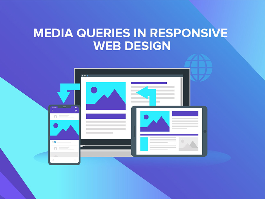
Responsive web design: example of media queries

3. Fluid Images

Unlike the fluid grid example, images are not fluid by nature. They have fixed sizing proportions, which can cause inconsistent presentation problems across multiple screen sizes.

On mobile, the user would have to zoom into different parts of the page to read the copy and in other cases, images could take up the entire screen, causing the need to scroll.

By applying a CSS/ HTML command, images acquire the necessary fluidity and automatically adjust to the relevant screen.

Now, let’s put the technicalities behind us and see why a responsive website is a a must-have in 2022 and beyond.

What Does Responsive Web Design Look Like?

When working with a web design company like Digital Silk, the process usually involves the provision of two UX designs: desktop and mobile.

Here’s an example of what responsive web design looks like:

design applied on different screens
Example of responsive UX (left) and UI (right) web design

The designers start with the desktop version, then scale it down to mobile.

The grayscale versions you see on the left are of the UX design on our Digital Silk website. The purpose of this black-and-white version is to map out the conversion funnel and content both on desktop and mobile devices.

Once the UX designs are confirmed by the client, the designers can proceed with user interface (UI) design which applies color, images, branding elements and other details onto the approved UX structure.

Responsive vs. Mobile-First Web Design: What Is The Difference?

Responsive web design and mobile-first web design each have their pros and cons. Let’s break down the key differences.

Mobile-first web design differs from responsive web design in:

  • Design process: With mobile-first design, web designers begin with a website that fits the mobile device first, before adapting it for desktop computers. By scaling from mobile to desktop layout, they ensure an excellent user experience characterized by fast download speeds, rich media content and easy navigation. Responsive web design, on the other hand, begins with the maximum required screen resolution. Designers narrow it down to smaller screens so the content and layout fit different devices.
  • Purpose: Although both B2B and B2C sectors use both mobile-first and responsive web design, responsive web design is more common among B2B businesses. Most B2B clients access their website via laptop or desktop computers which makes this type of design a priority. For B2C businesses, mobile-first is ideal because their customers are on the go and the majority use smartphones.
  • UX: Both responsive and mobile-first designs aim to create a seamless UX across multiple screen sizes. The only real difference comes in terms of the design process. While a responsive design will include adaptable elements to ensure cross-channel synergy, a mobile-first design will focus on smaller screen functionalities before working up toward desktop UX-optimization.
  • SEO: Responsive web design focuses primarily on providing value to the user by giving them an easy-to-use design across devices—something Google sees as a huge plus in its ranking factors. Mobile-first designs instead limit potential issues with duplicate content and technical faults, while also opening opportunity to align with Google’s mobile-first crawling and indexing methods.
Is responsive or mobile-first web design right for you? Consult Our Experts

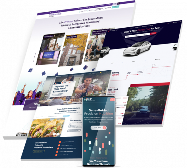
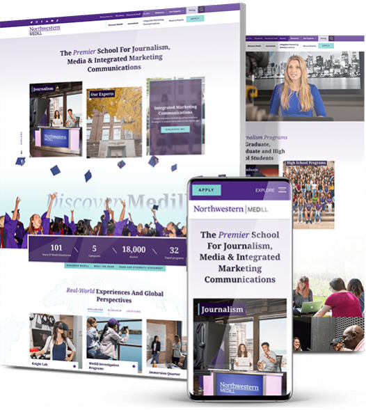
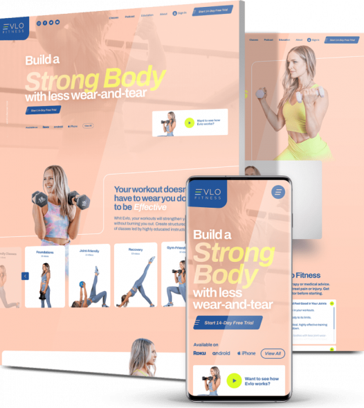
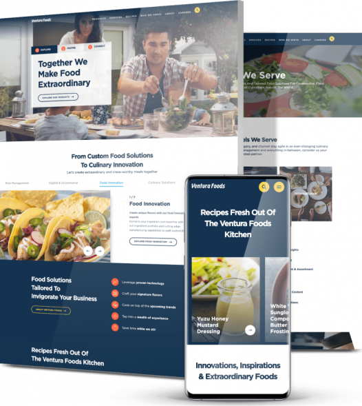
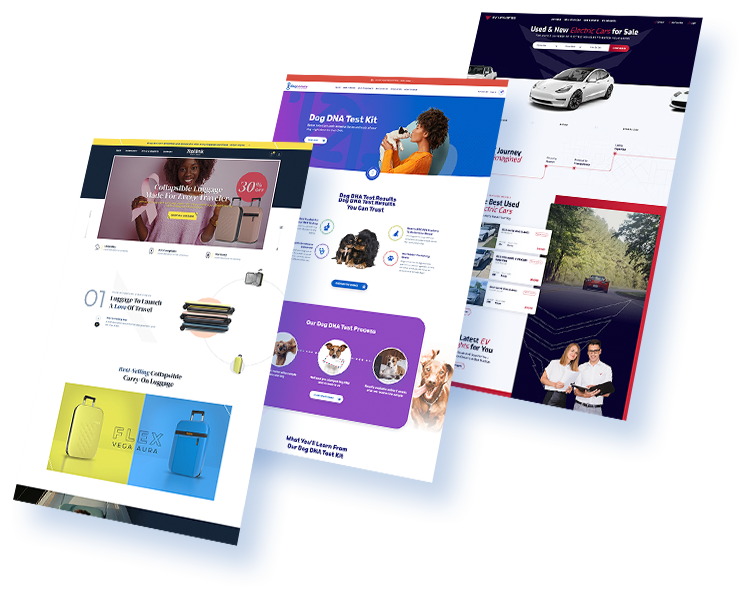
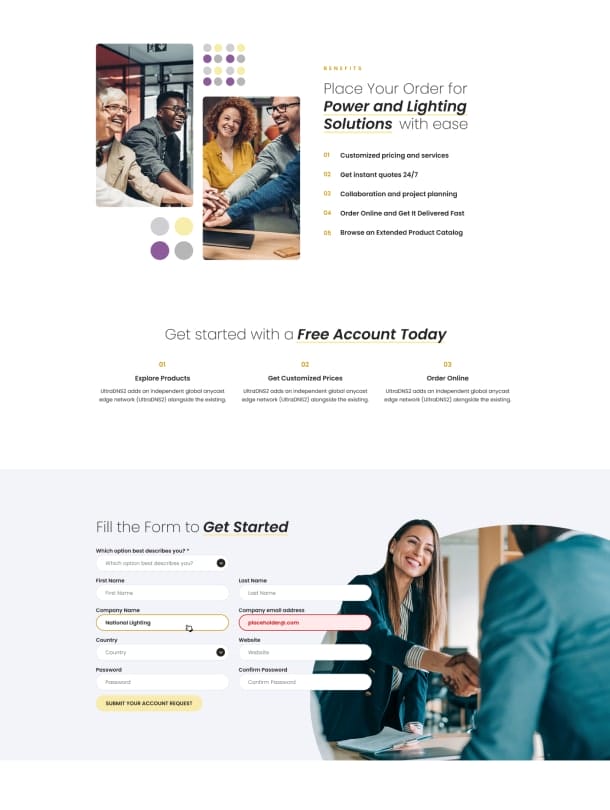
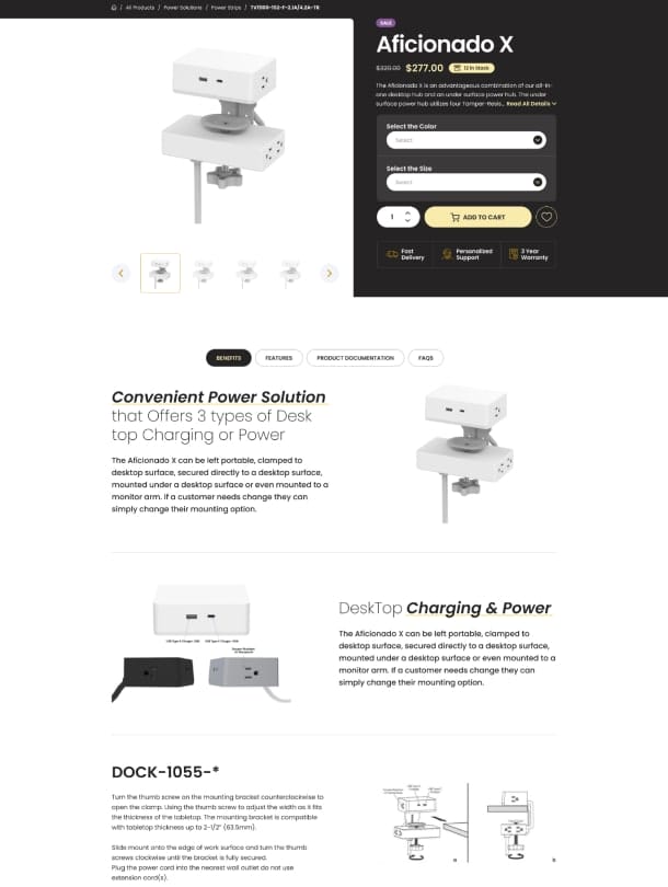
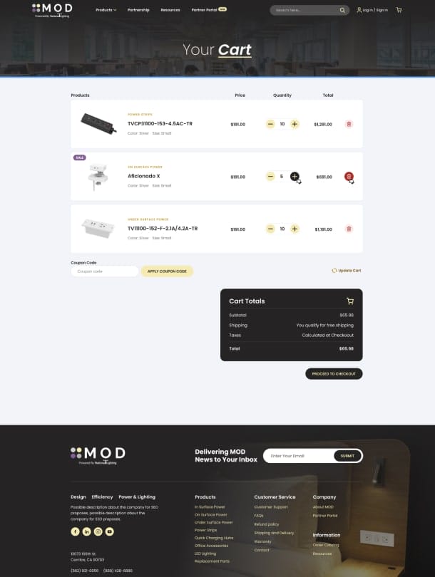
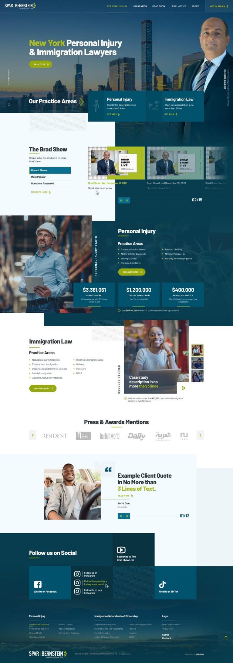
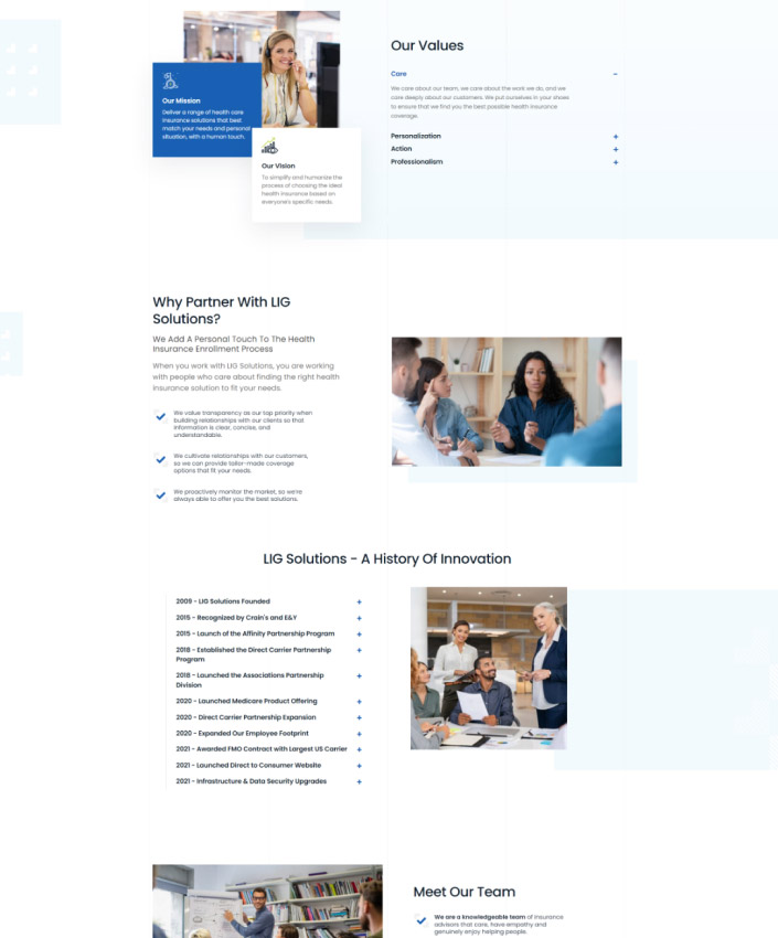
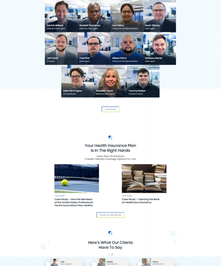
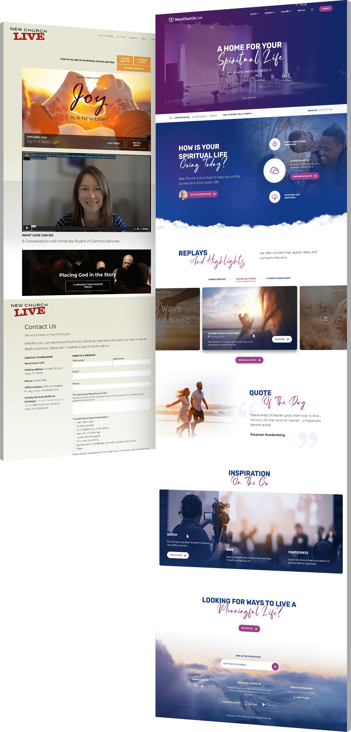
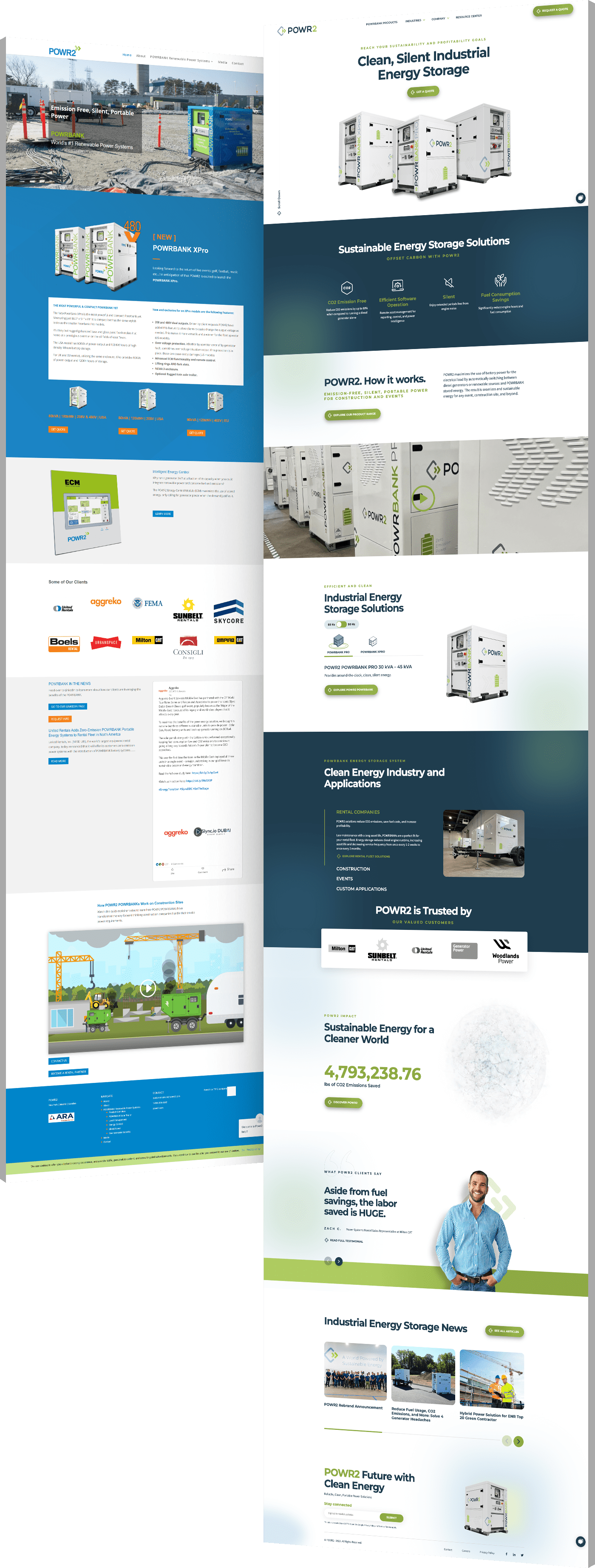
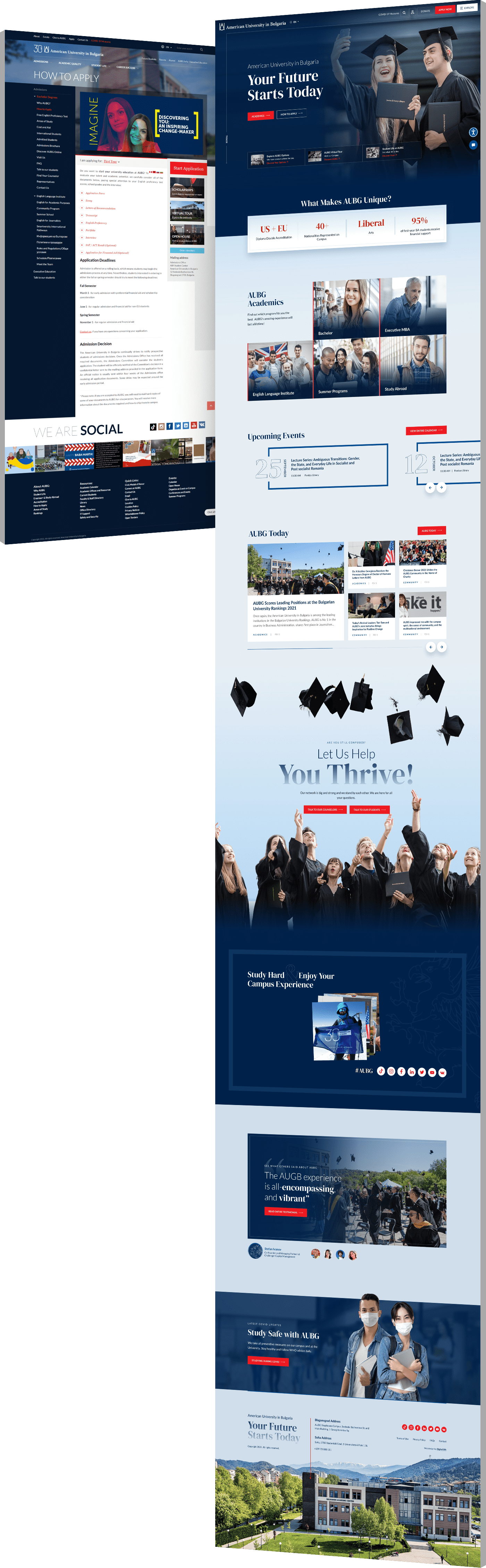
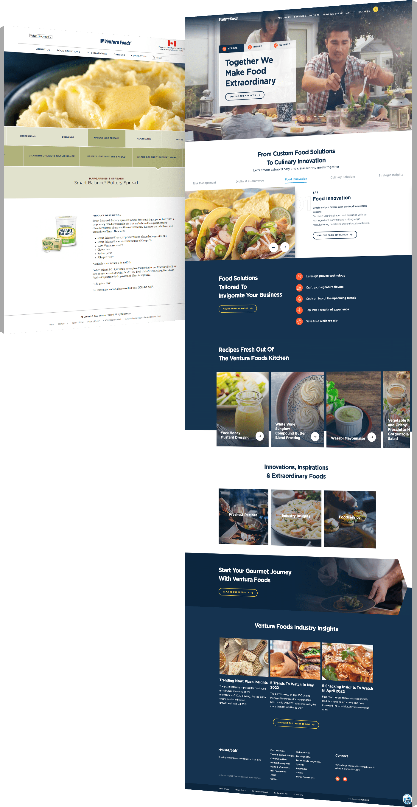
Responsive Web Design Examples From Renowned Brands

To put UX/UI design into perspective, let’s take a look at some of the best examples of websites built on a responsive design principle.

These examples will show you the difference between desktop and mobile versions of websites and demonstrate the importance of having fluid grids and flexible images that adapt to different screen sizes.
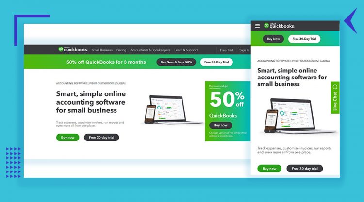
1. QuickBooks

With a lot of white space in both the desktop and mobile version of its website, QuickBooks offers a clean page layout, a clear value proposition in the hero section and distinctive color for CTA buttons that allows them to stand out.

The desktop version features a complete navigation bar in the website header, as well as additional information about the special offers in the hero section.

On the other hand, the above-the-fold area on the mobile version shows just the key information with a hamburger menu and to-the-point CTAs. Thanks to this responsive design, the user is able to get the full brand experience on both desktop and mobile.

QuickBooks desktop and mobile screenshots as an example of responisve web design
[Source: QuickBooks]

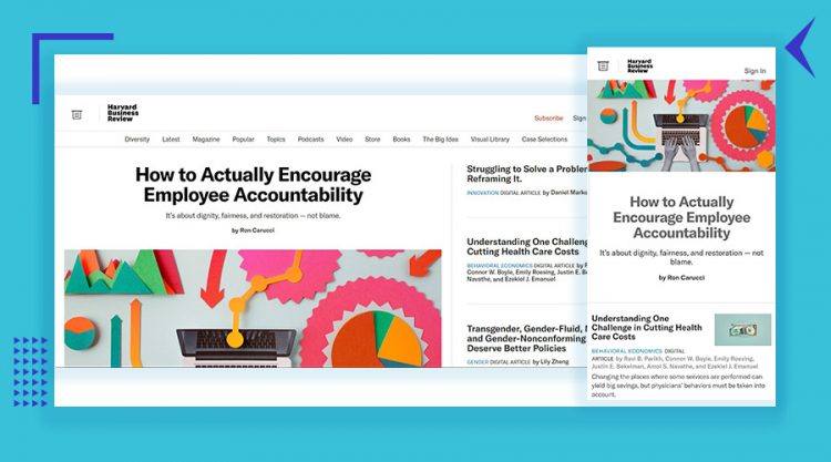
2. Harvard Business Review

As a media company, Harvard Business Review has a desktop website with more headlines and stories in the hero section than on its mobile counterpart.

However, both website layouts present one main article with a large featured image, while other headlines are text-only. The key article stands out to the user, regardless of which device they’re on.

Another important difference between the desktop and the mobile version is that the larger screen holds a capacity for showing the navigation bar with main categories, while the whole menu is visible only after clicking on the menu icon on smaller screens.

Overall, the user experience is similar and key points remain in view for users on all devices.
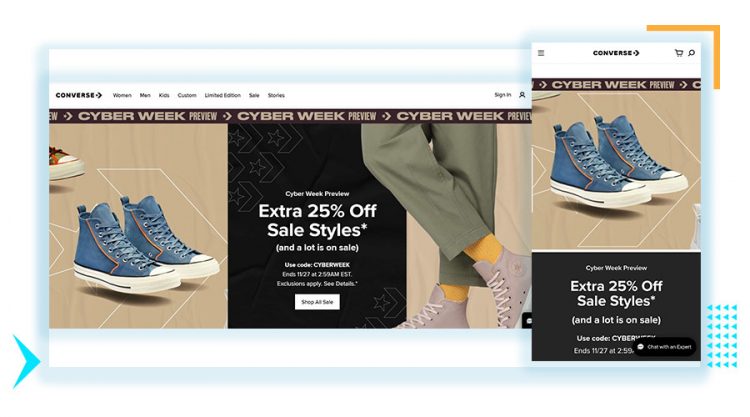
HBR desktop and mobile screenshots to represent responsive design
[Source: Harward Business Review]

3. Converse

Similar to the previous example, Converse offers a category page menu in the desktop website header, as well as options to sign in, set a user profile, search the site and see the wish list and shopping cart.

The mobile version header is reduced to a hamburger menu, shopping cart and search icons.

The information displayed in the hero section on both versions is the same, including the slider with different products.

But the desktop version shows an additional image and a distinctive CTA button, while the same call to action on the mobile version isn’t visible until visitors scroll down.

Considering that all content on a desktop version won’t realistically fit into a mobile version, Converse does a good job at providing a similar user experience across both devices.

Converse responisve website design desktop and mobile view
[Source: Converse]

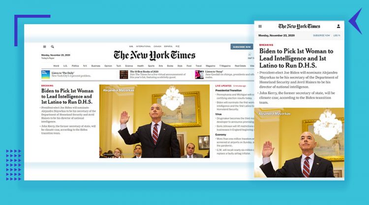
4. The New York Times

The New York Times is a great example of a responsive website for a daily newspaper and a news portal.

The desktop version offers much more information, of course, ranging from the news categories in the navigation bar and the choice between local and international issues, to additional featured stories and even the current temperature in New York.

The mobile version of the website is much more streamlined, featuring a date and Subscription and Sign In buttons in the header, followed by a single news story above the fold.

Looking at the two side-by-side, it’s clear that the mobile design keeps the key information of the desktop version: The top story and graphic, a menu icon and a sign-in icon to allow users to enter the site and explore more.
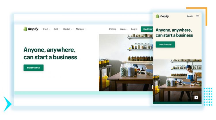
The New York Times desktop and mobile home page view as an example of responsive design
[Source: The New York Times]

5. Shopify

Shopify is a great example of simplistic responsive design, thanks to the clear and concise copy, original high-quality imagery and stand-out CTAs.

The navigation menu with drop-down options in the desktop version adapts to a smaller screen in the form of a hamburger menu. Besides that, the desktop header leads to “Pricing” and “Learn” pages, while the mobile version is reduced to a single “Log in” button.

The clean design makes ample use of white space, instead of trying to shove copy and elements into the design, which could overwhelm the user. Leave it to a clear UVP, high-quality video and attractive CTA to create an engaging user experience.

Shopify desktop and mobile screenshots as an example of responsive web design
[Source: Shopify]

Have you noticed how each of these examples showcases a simplified, decluttered and attractive layout that naturally fits into smaller screens, while the desktop versions offer more information, larger images and various CTA buttons?

That’s the essence of responsive web design. The idea isn’t to cram all of the information from a desktop site into a small mobile device screen. The idea is to keep the key information and ensure the user gets the same or similar experience on all devices.

Ready to create an industry-leading responsive website? Get A Proposal

Why Is Responsive Website Design A Must?

  • According to Statista, more than half the people that will land on your website come from mobile. Your website needs to operate, function and respond at the same speed and efficiency as the desktop version.
  • Brand consistency and uniform user experience (UX) are key. Whether on desktop, mobile or tablet, your user should have a seamless, uniform experience across all devices and all interactions with your brand.
  • Google uses mobile-first indexing, which means your site has a better chance of ranking if you have a responsive web design that displays properly on mobile.
  • Separate websites require more maintenance. Responsive web design ensures a proper layout on every screen size, with one web design.
  • A responsive web design will help decrease your bounce rate on mobile and other handheld devices. If a website isn’t loading properly mobile users will bounce quickly and avoid returning again.

Responsive Web Design Best Practices

When it comes to building a responsive web design, there are certain best practices to keep in mind to ensure your site functions as it should, and ultimately offers a consistent user experience.

1. Consider CTA Placement & Frequency

CTAs are the holy grail of website elements.

Amidst the hustle and bustle of adjusting content to fit the relevant screen sizes, never neglect the importance of your CTA.

  • Make your CTAs visible to the user upon landing
  • Include more than one CTA throughout each page
  • Make CTAs stand out using engaging action verbs
  • Consider the size of CTAs to ensure they stand out on smaller screens
Responsive web design - Illustration with CTA placement
CTA’s placement, size and frequency is of utmost importance for responsive web design

2. Choose Typography Carefully

In 2012, American film director Errol Morris wrote a piece for the New York Times titled “Are You an Optimist or a Pessimist?”

What people reading the article didn’t know was that Morris was conducting an experiment on the effect of typefaces in changing people’s opinions.

Six typefaces were used in this experiment: Baskerville, Helvetica, Comic Sans, Computer Modern, Georgia, and Trebuchet. In a follow-up article, he shared the results.

  • Comic Sans caused the most disagreement
  • Baskerville had the most positive responses

Choosing a font type might seem tedious to most, but history and data tell us otherwise. Fonts can make or break your website. As iA very aptly puts it in a recent article, “web design is 95% typography.”

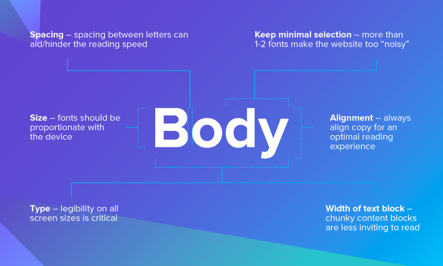
Here are a few font-specific details you need to be mindful of:

  • Type: Legibility on all screen sizes is critical
  • Size: Fonts should be proportionate with the device
  • Spacing: Spacing between letters can aid/hinder the reading speed
  • Width of text block: Chunky content blocks are lees inviting to read
  • Selection: More than 1-2 fonts make the website too “noisy”
  • Alignment: Always align copy for an optimal reading experience
responsive web design: illustration of font details
Choosing the right font improves the UX of your website

3. Prioritize User Interaction (UI)

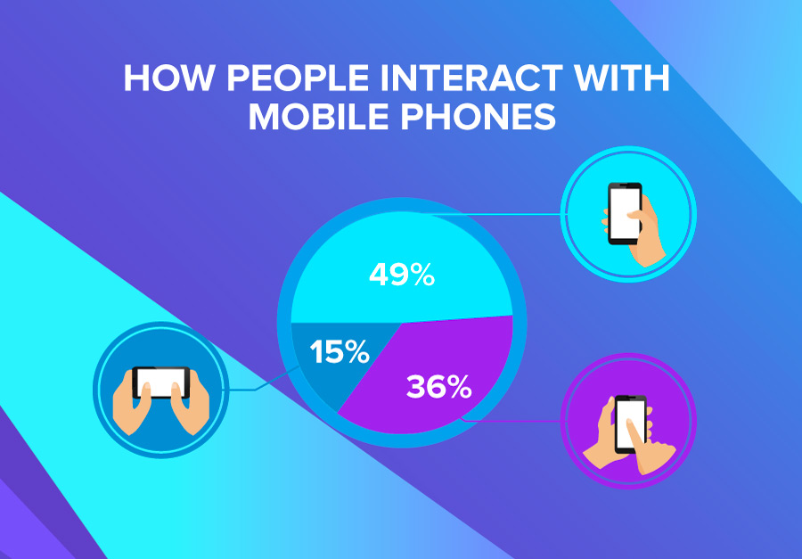
Designing for specific screen sizes is not just about the dimensions, it’s also about the way a user interacts with a specific device. Here are a few things to consider:

  • For desktops, visitors use a cursor
  • For tablets, visitors use an index finger
  • For mobile devices, visitors use a thumb

Taking into consideration that 49% of people use their mobile device using one hand, the thumb suddenly becomes a focal point. Critical content and CTAs should be within reach of the thumb when considering mobile screens.

Responsive web design: illustration of mobile interaction
[Source: UX matters]

Schedule A Consultation With Our Responsive Web Design Company

At Digital Silk, we create custom responsive websites unique for each brand, to increase visibility and traffic, ensure a consistent brand experience and ultimately, increase conversions.

As a full-service web design agency, we are also specialists in creating designs that appeal to the right user intentions.

We offer a free consultation & custom proposals for custom website design projects. Simply fill out the Request a Quote form, tell us about your goals and our experts will provide you with actionable insights and cost estimates.

Or, call us at (800) 206-9413 to start the conversation.

Background Gradient

Responsive Web Design Company FAQs

Responsive web design refers to the process of adapting a user interface and experience to a user’s platform or environment.

Designers and developers will create a website that responds to multiple devices, such as mobile or desktop, as well as screen orientation and size.

A responsive website will cost more than a one-size-fits-all templated design as it requires a greater extent of coding and expertise.

There is no exact figure to state as each project will be influenced by its own individual parameters. However, some extremely inclusive and complex website designs can cost hundreds of thousands of dollars.

Request a quote from our award-winning designers to receive a custom cost estimate for our responsive web design services.

As an international company with expert designers based both in the United States and beyond, our responsive web design services can be enjoyed by anyone, anywhere.

So, whether a construction company in California or a hotel in Houston, we are on hand to elevate your digital experience across channels and devices.

Contact our team today to receive a free, custom quote and consultation for your responsive design project.

Thank You!

We emailed you the download link. Check your inbox and enjoy the whitepaper!

Questions? Contact Us

Digital Trends Guide

Download Our
2024 Guide To Growing Brands Online

"*" indicates required fields

This field is for validation purposes and should be left unchanged.

2024-digital-trends-guide_V1
Background Gradient
Our Experts Have Won Industry Awards

Recognized Digital Agency Experts

Awards
Digital Silk IMA award
Digital Silk Telly award
Marcom_logo
Digital Silk Horizon Interactive award
Digital Silk Communicator award
Videographer_logo
Digital Silk Awwwards
Digital Silk W3 award
Recognition
FoxNews_logo
Vector (5)
Adweek_logo 1
New_Bloomberg_Logo 1
CNBC_logo 1
wcbs-newsradio-880 WHITE 1
ABC_News_solid_black_logo 1
Reuters_Logo 1
Expertise
  • Brand Strategy
  • Communication Strategy
  • Logo & Graphic Design
  • UI & UX Design
  • Package Design
  • Custom Web Design
  • eCommerce Development
  • Mobile App Development
  • Software & AI Development
  • ERP Portal Integration
  • Marketing Strategy
  • Social Media Marketing
  • Search Engine Optimization
  • Paid Media Marketing
  • Email Marketing
  • Creative Copywriting
  • Content Marketing
  • Influencer Marketing
  • Affiliate Marketing
  • B2B Direct Marketing
REQUEST A QUOTE